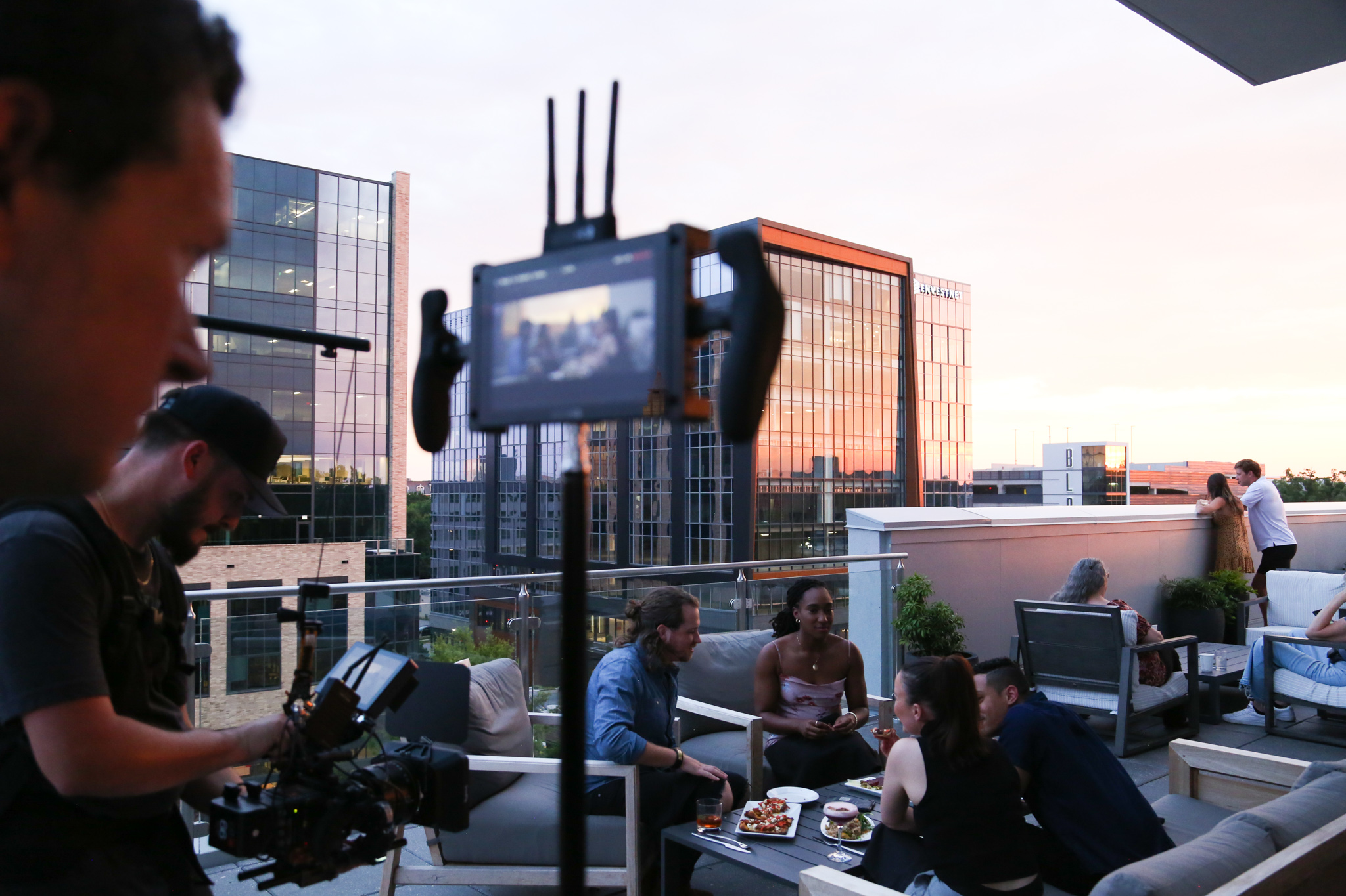
We recently created a motion graphics piece that went rather smoothly.
A lot of this had to do with the way the design was handled before ever getting to the animation stage. There are other things to consider as well, such as a script written with design in mind, and of course, having a great client to work with helps. (shout out to our BFF’s at First Bank) So when it comes to designing for 2D or 3D animation, I always follow these steps to assure a seamless workflow.
ORGANIZE
Organizing your files is the step that is the easiest to preach, but the hardest to actually follow. But, I can’t express enough how much time you save from organizing your files from beginning to end. It’s best to start with a catch-all folder to house any files you have, from inspiration to final files. Within that folder, create a subfolder for every step of the process such as copy, design, animation, renders, etc. And even more important when it comes to organizing, is the file system within your animation program. Whether you are working in AE, Cinema 4D, whatever it may be, properly naming and grouping files will go a long way when it gets down to the last minute and you need to quickly find the scene or layer you need.
WRITING
Whether you are writing the script, working with a writer, or working from a script, the most important thing to look for is keywords. Pairing strong visuals with powerful keywords is important for making a strong motion graphics piece. If you are writing the script, try to include a keyword in every sentence that you know you can pair a visual with. And if you are working within a time frame, make sure you have plenty of time to push and pull the VO around, allowing for some breath in the animation.

LAYER. EVERY. SINGLE. THING.
Having everything in layers may seem difficult or like a larger task in the beginning, but the payoff in flexibility and motion in the end is worth it. If you have to design a house, maybe consider giving it shingles. The shingles could create a fun way to animate the house as opposed to a flat solid. And since typography often plays a major part in motion graphics design, it never hurts to break them down per line, or type per character.
KNOW HOW EACH ELEMENT WILL ANIMATE
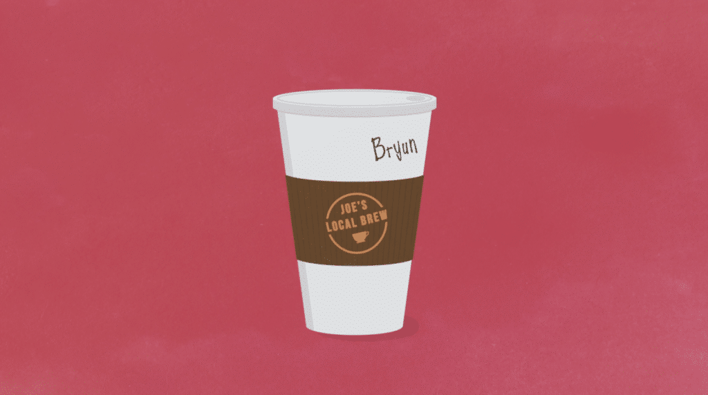
Understanding the personality of the motion graphics will help define how you create the assets. If it’s a fun, bubbly piece, you’ll want to create your assets with a bouncy, fluid motion in mind. Will the piece require constant movement and need many constructible elements? Ask yourself, will it drop, flip, slide, bounce, fade, stretch, morph, and so on? It helps to have a reference to keep you grounded. That reference can be as small as the way the Favorite icon works when tapped on Twitter. I mention that because that was the entire inspiration for the First Bank piece, and from there it just naturally flourished.
SEAMLESS TRANSITIONS
If you are trying to create a seamless animation, without cuts, try to think of how each scene can transition into each other. The key to doing this successfully will come with designing in order, from first to last frame. In doing so, you’ll be able to make easy connections with certain elements and by the end of it, see a very concise map or pattern. You may even find an
element that can carry through the entire motion graphics piece, giving the viewer something to focus on.
CUT TO SCENE AS OPPOSED TO ANIMATED TRANSITIONS
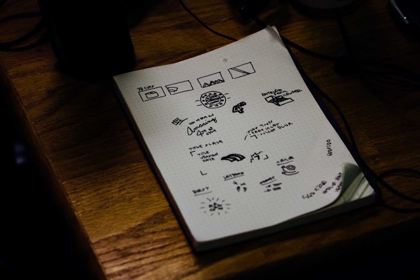
If you are planning on having multiple cuts in the animation, you’ll need to change your way of thinking. If you think about it in the mindset of a director or film editor, your thought process will be more open, and allow you to think of more engaging shots and compositions. Is it a close-up, medium, or wide shot? Is the camera moving? With this route, most aspects of shooting and editing film, now apply to your motion graphics, so be sure to put a lot of thought into composition when storyboarding.
TYPOGRAPHY
When working with typography in motion graphics design, there are additional things to consider when designing. The viewer may be watching the video on a 70” TV or on a phone, and yet your type needs to be legible on both. Often you may be confined to a certain typeface to keep branding consistent. If this is the case, find a way to stylize the typeface that makes it work with the piece. If brand guidelines allow, add effects or a style to the typeface that makes it feel more in sync with the visuals. If brand guidelines don’t allow, and you’re not working with an ideal typeface, be sure to have smart and entertaining animations within your type.
CONCLUSION
So, if you want a quick guide to remember, or you just like to scroll down to the bottom of an article looking for the answer, here it is. Again, everyone works differently, so if you hate this advice and you work a completely different way, feel free to yell at me and share your thoughts. Enough yappin’ here’s your quick guide to designing for motion graphics. Enjoy!
- Take time to organize files from beginning to end
- Use, find and focus on visually rich keywords to design towards
- Layer every single asset to allow for flexibility in animation
- Keep in mind how each element will animate while designing them
- Design in order of first to last frame for seamless animations
- Focus on unique compositions when animating with cuts in mind
- Use typography that works on all screen sizes from small to large
